Winners Treasure Hunt
Enhancing the in-store Shopping Experience
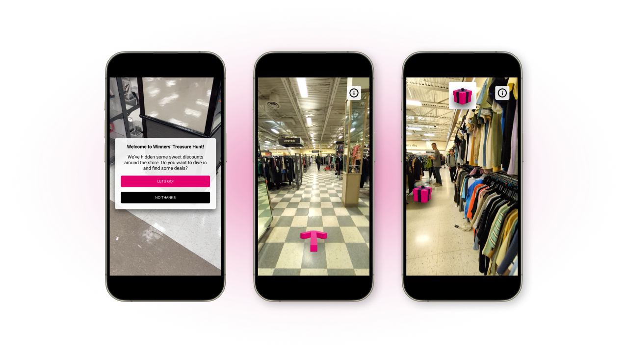
The Winners Treasure Hunt is a contextual based augmented reality app that allows
visitors to find prizes hidden virtually at Winners locations and designed to gamify
and further emphasize their unique retail experience.
Industry
Retail
Role & Team
UX Designer, Team of 4
What I did
Enhancing the Winners in-store experience
We were tasked with designing an imaginative solution to improve the retail experience
of Winners, and enhance how customers discover and purchase apparel. By their own words,
the Winners shopping experience is that of a “Treasure Hunt.” We wanted to emphasize
this experience through a unique AR application where visitors can search for a
variety of randomized promotions in store.
My Role
The team consisted of 4 UX designers, including myself. I was in charge of completing
the final mockups and demo scenarios, ensuring that the product aligned with the Winners
brand and overall team vision by bringing together all our pieces of work from video,
text descriptions and user interface flows into one cohesive piece.
Who’s it for?
The Winners Treasure Hunt is for any Winners customer. This includes all adults, teens, and
children with parent or guardian consent.
Research
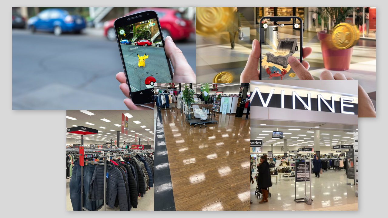
As described, our main takeaway was that Winners see their shopping experience as a
treasure hunt, which informed the direction of the Winners Treasure Hunt. We took
inspiration from Pokemon GO and other 3D navigation apps and games for navigation
and motion. We also made sure to reference images of Winners and their online media
to determine its visual language.
Mapping the Store
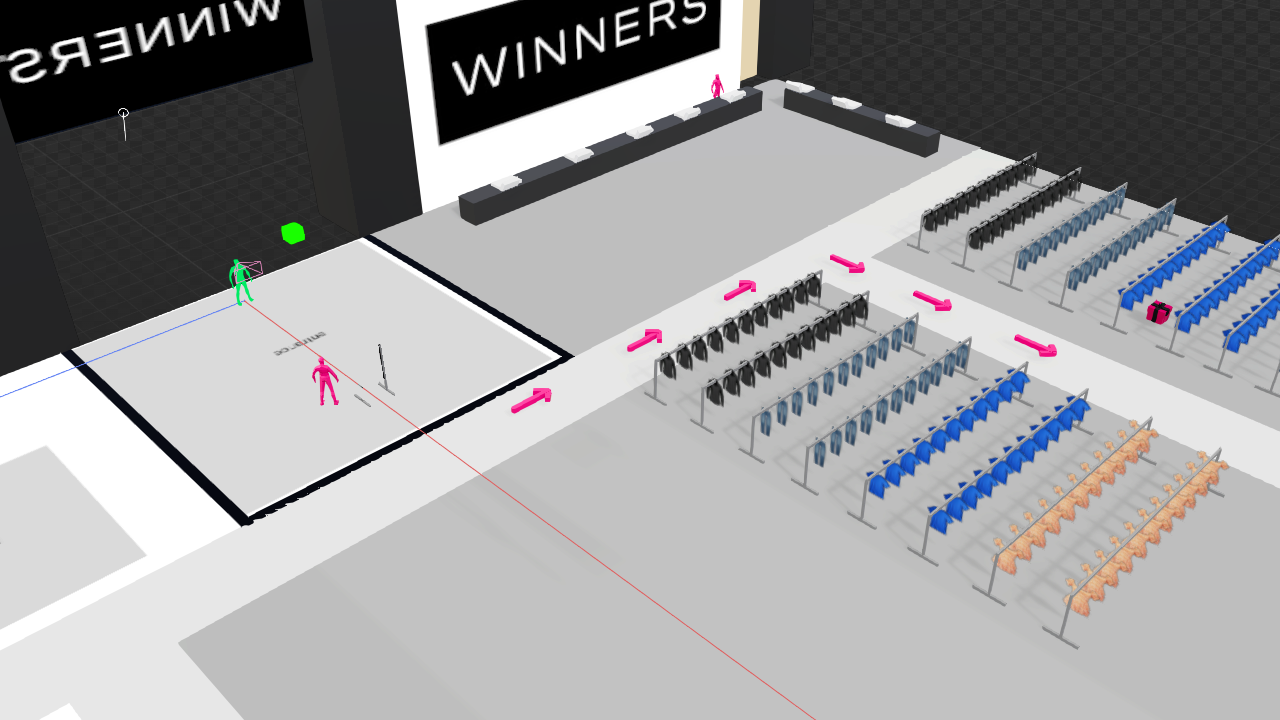
We made sure to visit physical Winners Locations to get a sense of the layout in respect
to the main clothing areas. We designed a simple layout in Bezi to illustrate this.
Designing a User Flow
After visiting the stores, we designed a flow that the game would follow intuitively
through the store. The whole experience and flow will be discussed in the final deliverables
section.
Product Mockups
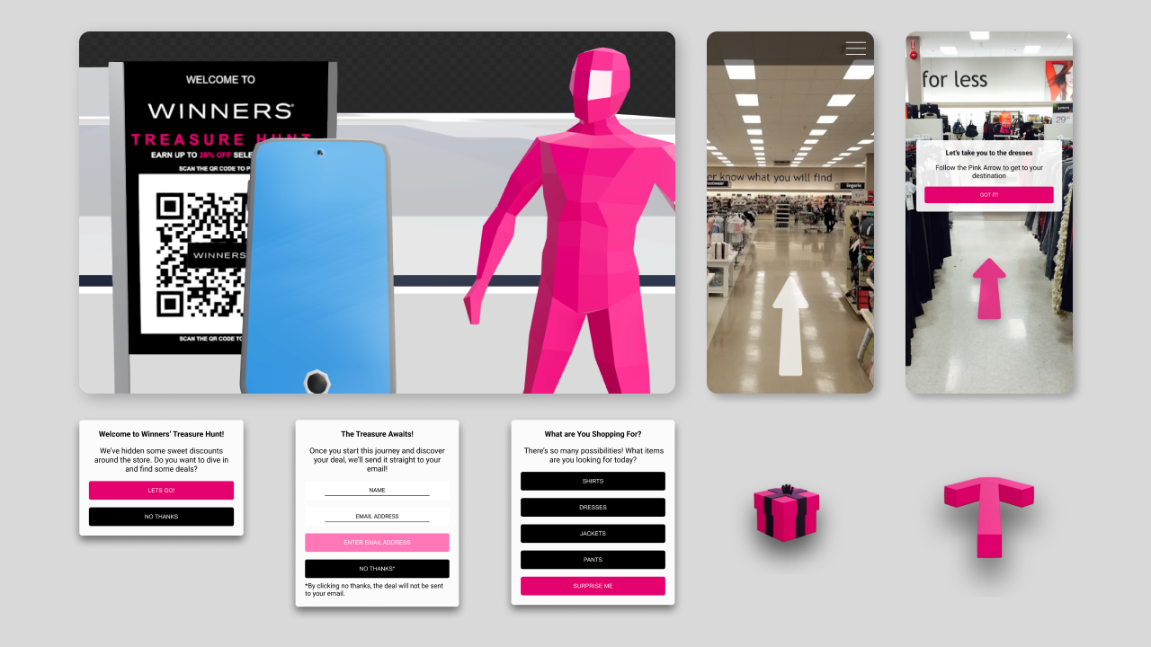
Next, we created our interface flow and elements for initial game prompts and the two types
of wayfinding. We were keen on making sure to iterate on the elements and make sure they are
visible in AR against the busy store aesthetics.
Final Deliverables
The final deliverable was a mockup and demonstration of how the app would work in real life.
These mockups and elements were created in After Effects, Bezi, and Figma.
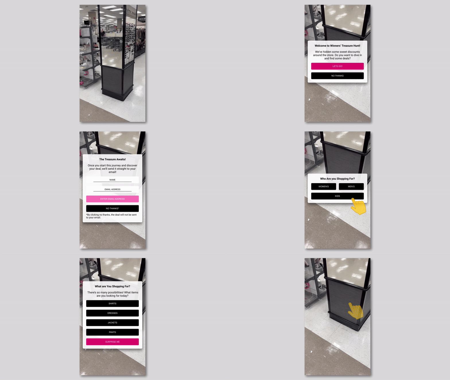
1. QR Code and Initial Prompts
Visitors will initiate the game by scanning the QR Code at the front of the store.
Visitors are prompted for their information and what they are looking for. This
will let the game know where to generate treasure. For example, if they are looking
for shirts, the game will generate treasure in the shirts area.
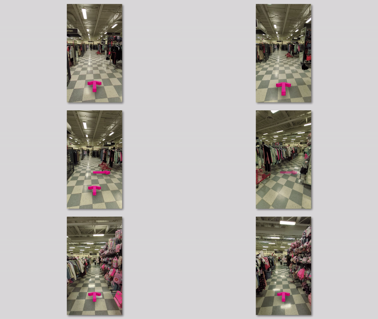
2. Wayfinding (For General Area)
The game will show visitors where the general area is. For example, shirts if
they have chosen it. We are very explicit in showing where to go through the use
of the pink arrow.
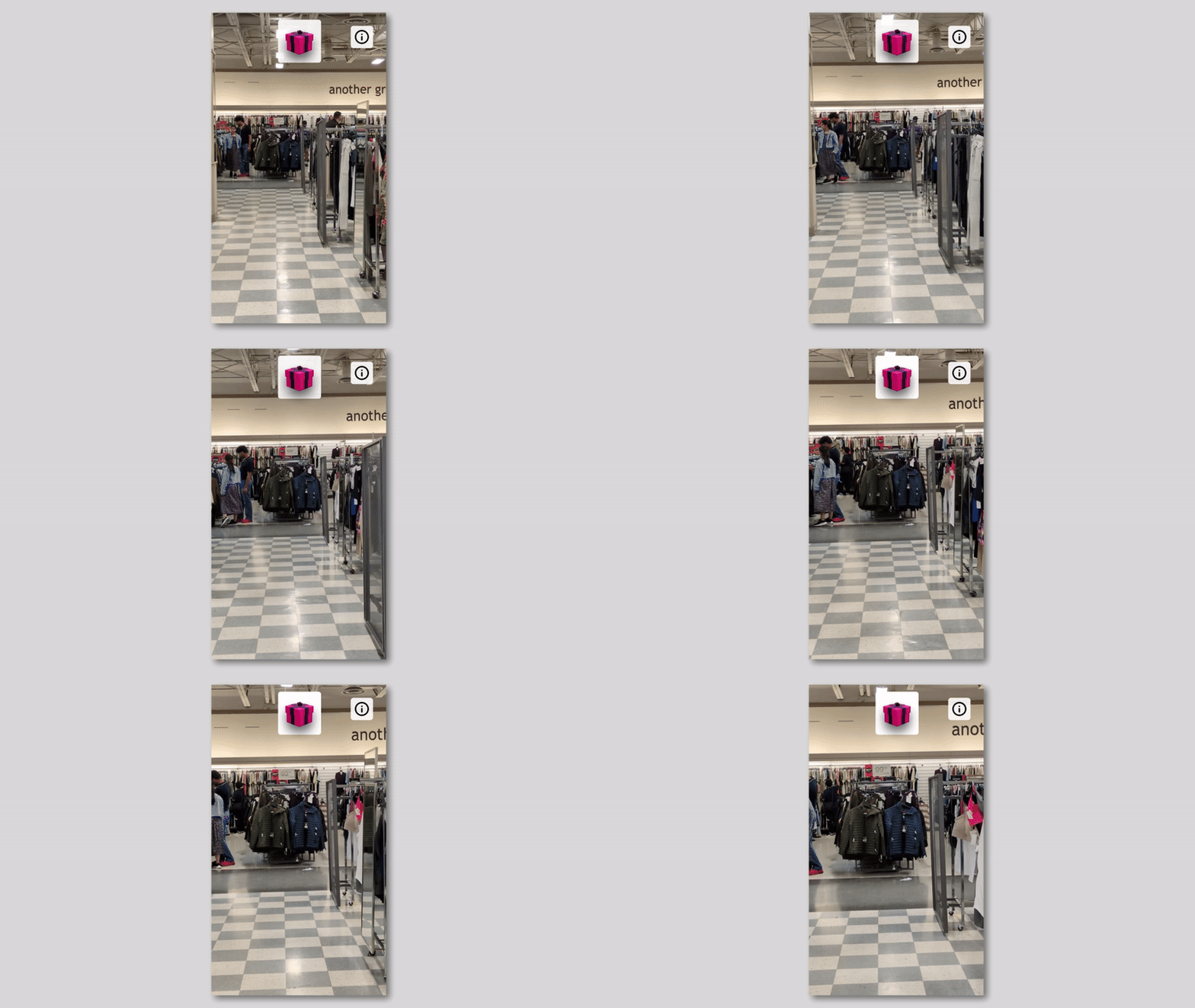
3. Wayfinding (For Treasure)
When the visitor reaches the desired area, the arrow leaves and is replaced by a
gift box that pulses based on the users proximity to the generated treasure.
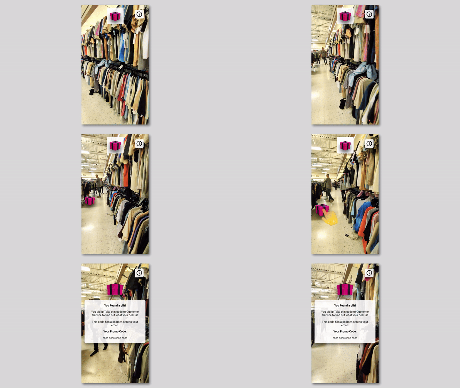
4. Prize Hunting & Redeeming
The Treasure will appear when in the view of the visitor. They can tap it as soon
as they see it to collect their prize. Prizes will be sent to visitors as a code
and can be redeemed at checkout or customer service.
From Pain Point to Selling Point
At the start of the project, our team had initially all seen the Winners shopping
experience as a pain point. We disliked how there was no “proper” inventory or collection
of items and wanted to design something that would allow visitors to more easily find items
they wanted. After further research, we learned that this treasure hunt shopping experience
was actually a feature, not a bug. This was the catalyst for how the Winners Treasure Hunt
turned out to be in its final form, and we were glad this insight changed our direction.
Overall, the Winners Treasure Hunt is an opportunity for visitors to experience shopping
at Winners using emerging technologies, while maintaining the surprise factor they know and love.
This project allowed me to use my previous digital media skills in After Effects
